Boost Your Brand’s Appeal | Psychology of Color in Digital Marketing
Colors are more than just a visual element; they are powerful tools in digital marketing that can influence consumer behavior. The hidden psychology of color in digital marketing reveals how different color shades can affect our emotions, decisions, and actions. Understanding this, can help businesses create more effective marketing strategies.
In this blog, we will explore psychology behind colors in marketing and provide practical tips on how to use colors effectively in your marketing efforts. From choosing the right palette for your brand to understand the emotional impact of different tones, Let’s uncover the secrets of color psychology that can help you connect with your audience on a deeper level.
What Is Color Psychology In Marketing?
The psychology of color in marketing and branding is an interesting area that shows how different colors can excite specific feelings and reactions from people. For example, red usually creates a sense of urgency, making it a popular choice for sales and clearance events. Blue, on the other hand, is calming and trustworthy, which is why many banks and tech companies use it in their branding.
In digital marketing, using the right colors can enhance user experience, increase engagement, and boost conversions. For example, a call-to-action button in a contrasting color can free stand out and encourage clicks. Similarly, a well chosen color scheme for a website can create an appealing look that keeps visitors on the site longer.
By tapping into the color psychology in marketing, businesses can create messages that connect more deeply with your audience. Whether you are designing a website, creating social media posts, or developing an ad campaign, understanding how colors affect consumer behavior can give you a competitive advantage.
Why Color Matters In Digital Marketing?
1. First Impressions
- Immediate Impact: Colors are one of the first things people notice about a brand. They create an immediate impression, before any text or other visuals are processed. This first impression can set the tone for how consumers perceive the entire brand.
- Brand Recognition: Consistent use of specific colors helps in brand recognition. People can identify a brand just by its colors, which is why companies like Coca-Cola (red), Facebook (blue), and McDonald’s (yellow and red) are so instantly recognizable.
2. Emotional Connection
- Bring Out Emotions: Different colors can excite different emotions and feelings. For e.g, blue can create a sense of trust and calm, while red can create excitement and urgency. Understanding these emotional triggers can help brands connect with their audience on a deeper level.
- Cultural Significance: Colors can have different meanings in different cultures. For example, white is associated with purity and peace in Western cultures, but it can symbolize mourning in some Eastern cultures. Brands need to consider these cultural differences in their global marketing strategies.
3. Consumer Behavior Influence
- Decision Making: Colors can influence buying decisions. Studies have shown that up to 90% of quick judgments made about products can be based on color alone. The right color can encourage a consumer to take action, whether it’s making a purchase, clicking a button, or signing up for a newsletter.
- Perceived Value: Colors can affect how consumers perceive the value of a product or service. For e.g, black and gold are often associated with luxury, while green is linked to eco-friendliness and health.
4. Brand Personality and Identity
- Reflecting Brand Values: The colors chosen for a brand should reflect its personality and values. A playful and energetic brand might use bright and vibrant colors, while a professional and trustworthy brand might choose more of classic tones.
- Consistency Across Channels: Using a consistent color palette across all marketing channels (website, social media, ads, packaging) helps create a brand identity, making the brand more memorable and reliable.
5. Visual Hierarchy and User Experience
- Guiding Attention: Colors can be used to guide the viewer’s attention to important elements on a page. For example, a brightly colored call-to-action button stands out and draws the eye, increasing all the clicks.
- Improving Readability: Proper use of color can enhance readability and the overall user experience. High contrast between text and background colors makes content easier to read and understand.
6. Psychological Triggers
- Creating Associations: Colors can create subconscious associations. For example, green is often associated with nature and health, making it a popular choice for organic and wellness brands. Blue is linked to trust and stability, making it a common choice for financial institutions and tech companies.
- Affecting Mood and Behavior: Colors can influence mood and behavior. Warm colors (like red, yellow, and orange) can evoke feelings of warmth and excitement, while cool colors (like blue, green, and purple) can be calming and soothing.
7. Competitive Advantage
- Differentiation: In a crowded marketplace, color can be a key differentiator. Unique and strategic use of color can help a brand stand out from the competition and attract attention.
- Brand Loyalty: Consistent and thoughtful use of color can help build brand loyalty. Consumers are more likely to return to brands that they recognize and trust, and color plays a significant role in this recognition and trust-building process.
Applying Color Psychology In Marketing
Now that we understand the basics of color psychology, let’s explore how to apply this knowledge to different aspects of digital marketing.
- Website Design: Choose a color scheme that reflects your brand’s personality and values. Use contrasting colors for buttons and call-to-actions to make them stand out. For example, if your brand is about health and wellness, a calming green and white palette might work well.
- Social Media: Use colors consistently across your social media platforms to create an attractive brand identity. Pay attention to the emotions you want to excite with your posts. For e.g, use vibrant colors for exciting announcements and softer tones for more reflective content.
- Advertising: The colors in your ads should align with your overall branding while also grabbing attention. If you’re running a limited-time offer, using red or orange can create a sense of urgency. In advertising the most important thing is graphic designing which helps in grabbing your audience’s attention, contact with the best graphic designing services to make your advertising more appealing.
- Email Marketing: Incorporate your brand colors into your email templates to strengthen brand recognition. Use color strategically to highlight important information, such as discounts or calls to action.
Color Breakdown In Digital Marketing
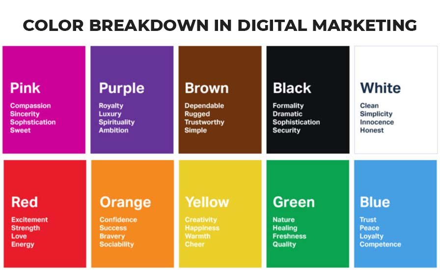
Red: The Color of Excitement and Urgency
- Emotions: Red is a very strong color. It can make people feel excited, passionate, or even a little bit aggressive. It’s a color that demands attention.
- Uses: Because it grabs attention, red is mostly used in marketing to create a sense of urgency. You’ll see it in clearance sales, on “Buy Now” buttons, and in important announcements.
- Examples: Think of brands like Coca-Cola and Netflix. They use red to stand out and create a sense of excitement.
Blue: The Color of Trust and Calm
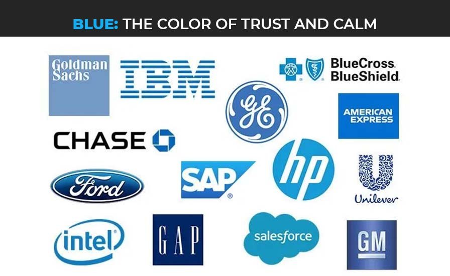
- Emotions: Blue is calming and makes people feel secure. It’s a color that builds trust.
- Uses: Blue is great for brands that want to appear professional and trustworthy, like banks, tech companies, and healthcare providers.
- Examples: Companies like Facebook, Twitter, and IBM use blue to show they are reliable and trustworthy.
Green: The Color of Nature and Health
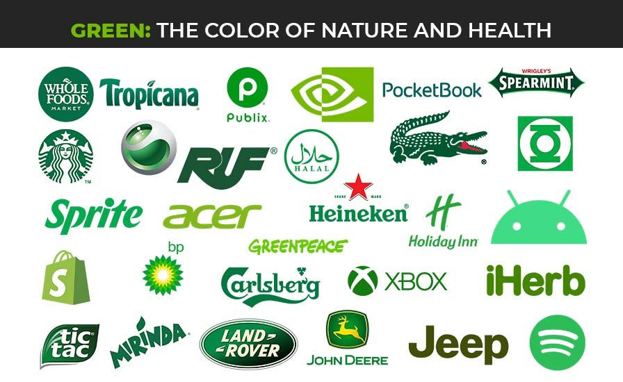
- Emotions: Green is associated with nature, growth, and health. It’s a refreshing and relaxing color.
- Uses: Brands that focus on the environment, health, or wellness often use green. It’s also used to indicate safety, like in traffic lights.
- Examples: Whole Foods and Starbucks use green to connect with nature and health.
Yellow: The Color of Happiness and Energy
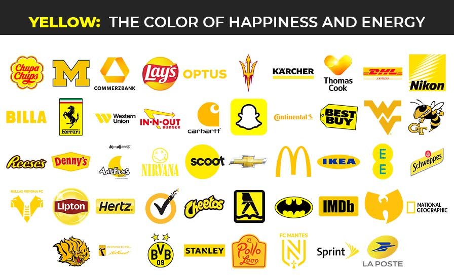
- Emotions: Yellow is bright and cheerful. It can make people feel happy, energetic, and optimistic.
- Uses: Yellow is great for catching attention and creating a warm, friendly vibe. It’s usually used in products for children and in casual dining.
- Examples: McDonald’s uses yellow to create a fun and happy feeling. Ikea uses yellow to catch your eye in their ads and stores.
Orange: The Color of Fun and Creativity
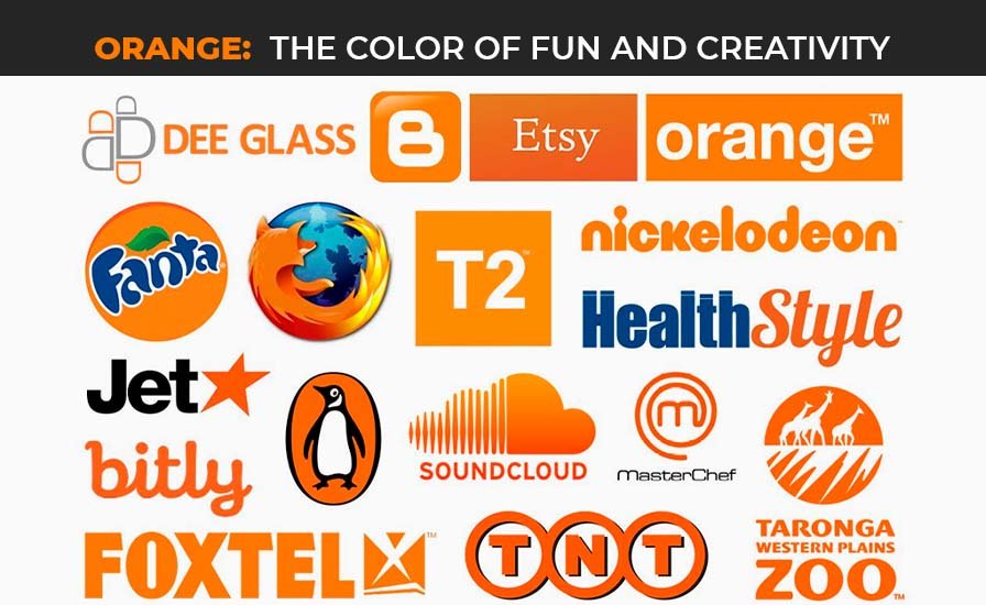
- Emotions: Orange is lively and playful. It’s a mix of red’s excitement and yellow’s cheerfulness.
- Uses: Brands that want to appear friendly, adventurous, and creative use orange. It’s often used in marketing for entertainment and food products.
- Examples: Nickelodeon and Fanta use orange to convey fun and energy.
Purple: The Color of Luxury and Imagination
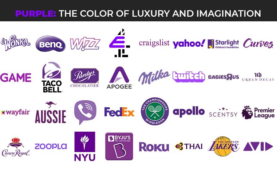
- Emotions: Purple is linked to royalty, luxury, and creativity. It can make people feel sophisticated and imaginative.
- Uses: Luxury brands and products related to beauty use purple to stand out and appear upscale.
- Examples: Brands like Cadbury and Hallmark use purple to add a touch of elegance and imagination.
Black: The Color of Sophistication and Power
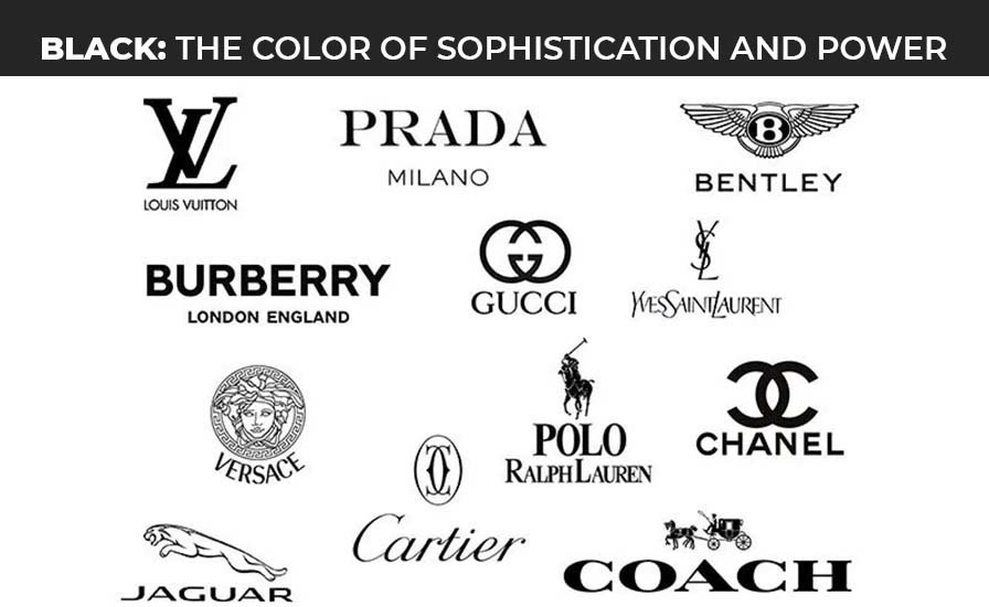
- Emotions: Black is sleek, modern, and powerful. It can create a sense of elegance and mystery.
- Uses: High-end brands use black to convey luxury and sophistication. It’s also used for bold, minimalist designs.
- Examples: Chanel and Nike use black to create a strong, sophisticated image.
White: The Color of Purity and Simplicity
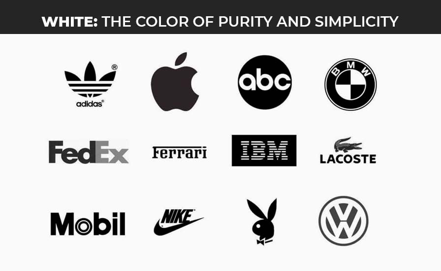
- Emotions: White is clean and pure. It makes people feel calm and can give a sense of space and simplicity.
- Uses: White is used in minimalist designs and by brands that want to appear modern and simple. It’s also a background color to make other colors pop.
- Examples: Apple uses a lot of white to create a clean, modern look. Many health and beauty brands also use white to convey purity.
Gray: The Color of Neutrality and Balance
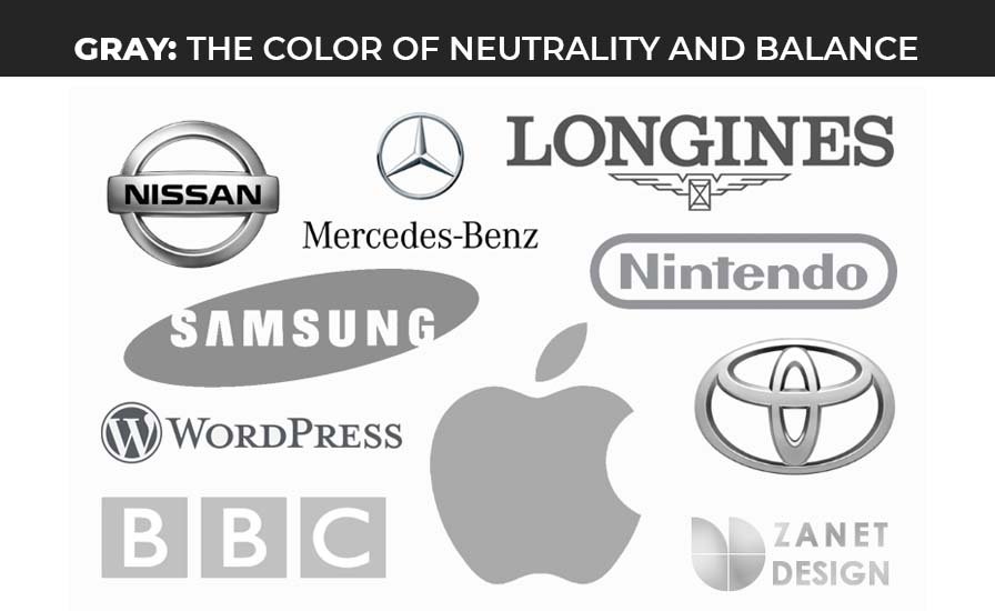
- Emotions: Gray is neutral and balanced. It’s calming and can be seen as conservative and formal.
- Uses: Gray is often used as a background color to highlight other colors. It’s used by brands that want to appear mature and reliable.
- Examples: Brands like Lexus and Apple use gray to show stability and simplicity.
Tips for Choosing the Right Color in Digital Marketing
1. Understand Your Brand Personality
- Identify Your Brand Values: Think about what your brand stands for. Is it playful and fun, or serious and professional? The colors you choose should reflect your brand’s personality.
- Match Colors to Emotions: Choose colors that excite the emotions you want your audience to feel. For example, if your brand is all about excitement and energy, red might be a good choice. If it’s about trust and calmness, blue could be better.
2. Know Your Audience
- Research Your Target Audience: Understand who your customers are. Different groups of people can have different color preferences. For example, younger audience might prefer bright and bold colors, while older audience might like more subtle tones.
- Consider Cultural Differences: Colors can have different meanings in different cultures. Make sure the colors you choose are appropriate for the regions you are targeting.
3. Look at Your Competitors
- Stand Out: Check out the colors your competitors are using. You don’t want to blend in with them, you want to stand out. If everyone in your industry is using blue, maybe you can try a different color to be unique.
- Industry Norms: While standing out is important, it’s also good to be aware of what colors are commonly associated with your industry. For e.g, green is popular in the health and wellness industry, and blue is common in tech and finance.
4. Use Color Psychology
- Learn About Color Meanings: Understand what different colors typically represent. For example, red can create a sense of urgency, green is linked to health, and purple is associated with luxury.
- Choose Colors That Match Your Message: If you want to create a sense of urgency in a sale, use red. If you want to promote eco-friendly products, green is a good choice.
5. Keep It Simple
- Limit Your Palette: Don’t use too many colors. A simple color scheme is easier on the eyes and looks more professional. Stick to 2-3 main colors for your brand.
- Create Contrast: Make sure there is good contrast between your background and text colors. This makes your content easier to read and more visually appealing.
6. Be Consistent
- Use Same Colors Everywhere: Use your chosen colors consistently across all your marketing materials, including your website, social media, and advertisements. This helps build brand recognition.
- Create Brand Guidelines: Develop a set of color guidelines for your brand. This should include your main colors, accent colors, and how to use them. Share this guide with anyone who works on your brand’s design.
7. Test and Get Feedback
- A/B Testing: Test different colors to see which ones perform better. For example, you can test two different button colors to see which one gets more clicks.
- Gather Feedback: Ask for feedback from your audience. You can use surveys or social media polls to find out what colors they prefer.
8. Use Tools and Resources
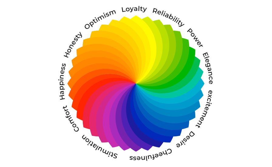
- Color Wheel: Use a color wheel to find complementary colors that work well together. Complementary colors are opposite each other on the wheel and create a pleasing contrast.
- Online Tools: Use online tools like Adobe Color to create and test color palettes. These tools can help you find colors that look good together and match your brand’s vibe.
Practical Steps For Choosing Color Psychology In Marketing
Define Your Brand’s Personality
- Make a list of adjectives that describe your brand (e.g., fun, professional, trustworthy).
- Look at color meanings and choose colors that match these adjectives.
Research Your Audience and Competition
- Identify your target audience’s preferences and cultural considerations.
- Analyze your competitors’ color schemes and find a way to differentiate your brand.
Create a Color Palette
- Choose a primary color that represents your brand.
- Select 1-2 secondary colors that complement your primary color.
- Pick accent colors for highlights and calls to action.
Design Consistent Branding Materials
- Apply your color palette to your website, social media, emails, and ads.
- Use your brand guidelines to ensure consistency.
Test and Adjust
- Conduct A/B tests to see which colors work best for different elements like buttons and headlines.
- Gather feedback and make adjustments based on what contrasts most with your audience.
Closure
After reading this blog, we explored the interesting facts about the psychology of color in digital marketing and how it can help you enhance your online presence. We learned that colors are not just visual elements, they are powerful tools that can influence emotions, perceptions, and behaviors. By understanding the hidden psychology of colors, businesses can create more effective marketing strategies that attract your targeted audience in many ways.
Stay Informed, Stay Ahead
Explore our insightful articles and stay updated on the latest trends, tips, and strategies shaping the digital marketing landscape.


